- The Obzia Newsletter
- Posts
- Breaking Down 3 Perfect Ecommerce Emails 👏
Breaking Down 3 Perfect Ecommerce Emails 👏
Victor Godsk
August 12, 2025


Hey, Victor from Obzia here!
Over the years, I’ve looked at thousands of ecommerce emails.
Some good. Some decent. Some terrible.
But every now and then, I come across a few emails that are damn near perfect.
Today, I’m breaking down 3 of them for you, so you can steal the ideas and apply them to your own email marketing.
Let’s roll.
Bite: Value Above the Fold
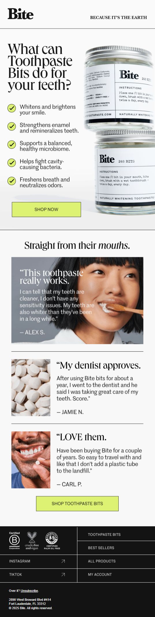 Bite | Here, Bite skips the typical “slow buildup” we see in many emails. |
Magic Mind: The Single Ingredient Zoom
 Magic Mind | Here, Magic Mind took one of the ingredients (Lion’s Mane) from their product and built a whole email focused on literally just that. |
Big Blanket: Curiosity Clickbait
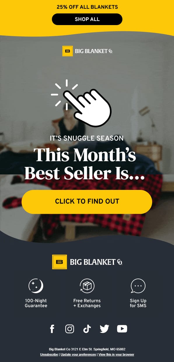 Big Blanket | Here, Big Blanket does something creative you don’t really see often. |
Today’s Takeaway
Most brands keep recycling the same safe templates and structures.
They’ve seen what a competitor does, then do the exact same thing, and never get creative with it.
But when you’re not afraid to once in a while break the pattern, whether it’s with the layout, the copy, the graphics, or the angle — that’s how you can successfully stand out in a crowded inbox.
My Favorite Email of the Day
The email: Click here to view »
Subject line: Summer Sale! Healthy Gut = More Fun This Summer
The brand: Grüns
My thoughts: I love that they don’t just lean on their current summer sale/offer to carry the messaging of the entire email.
They also include a catchy header title, and some concise product information explained with a clean infographic. A simple thing lots of brands could learn from.
Helpful Links Worth a Look
Let me know if there’s something specific you want me to cover at some point in these emails.
Until next time,
Victor from Obzia
P.S. If you want a free email account audit and a 60-day roadmap for scaling your email channel, book a discovery call with me here »